SIBLING - BRAND START UP
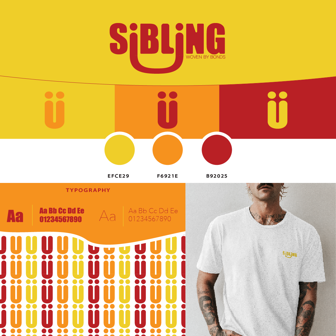
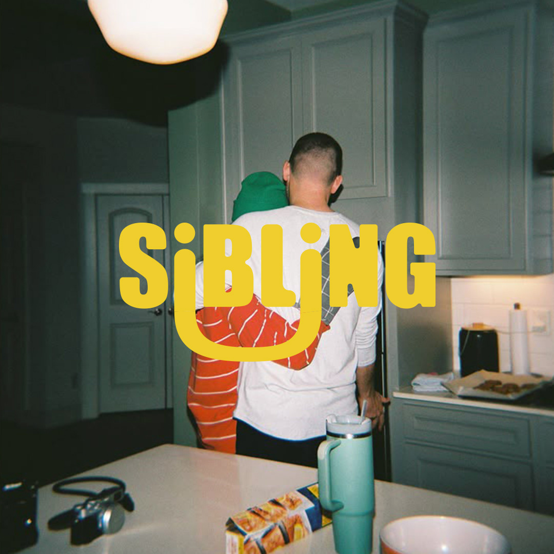
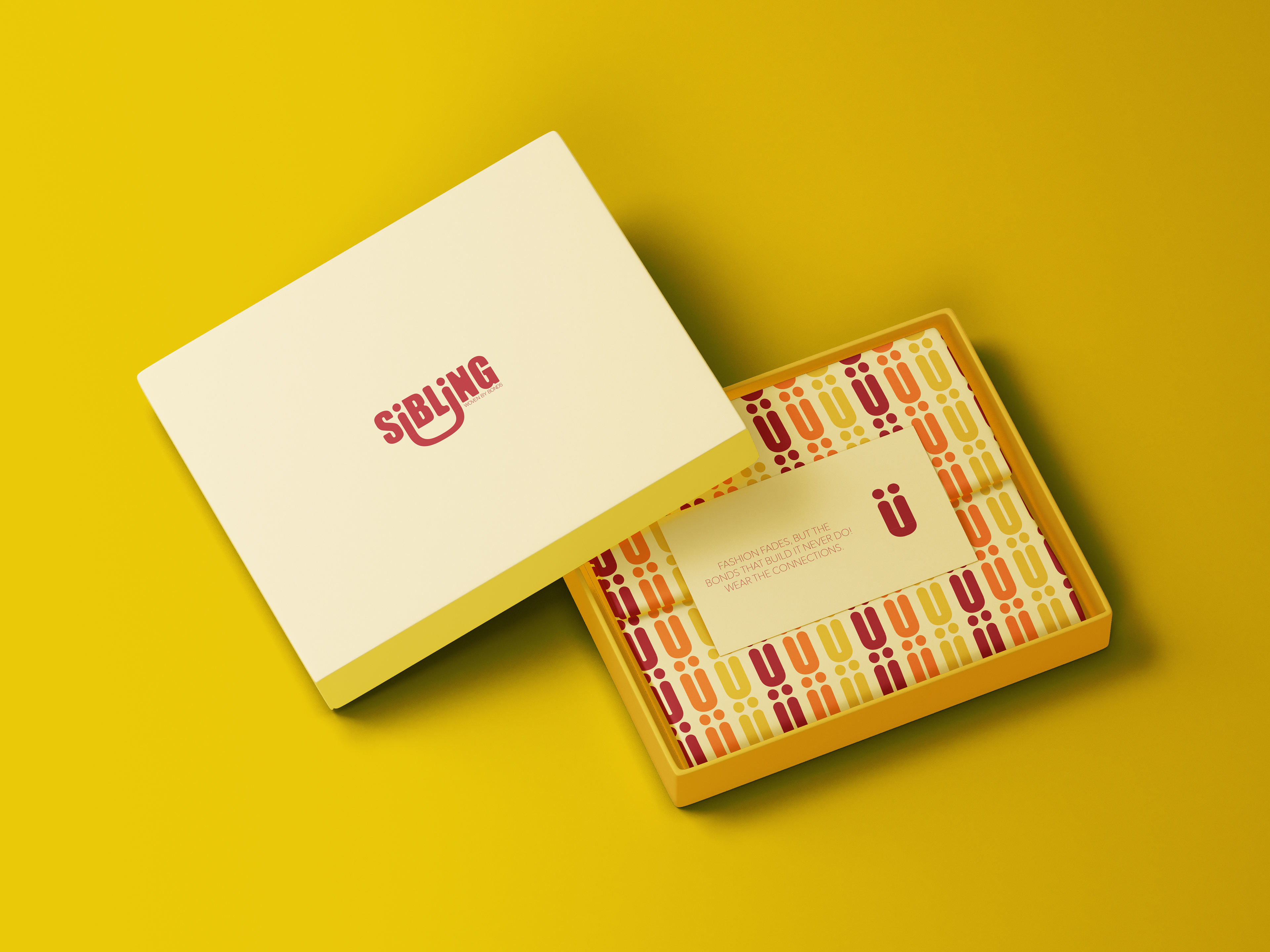
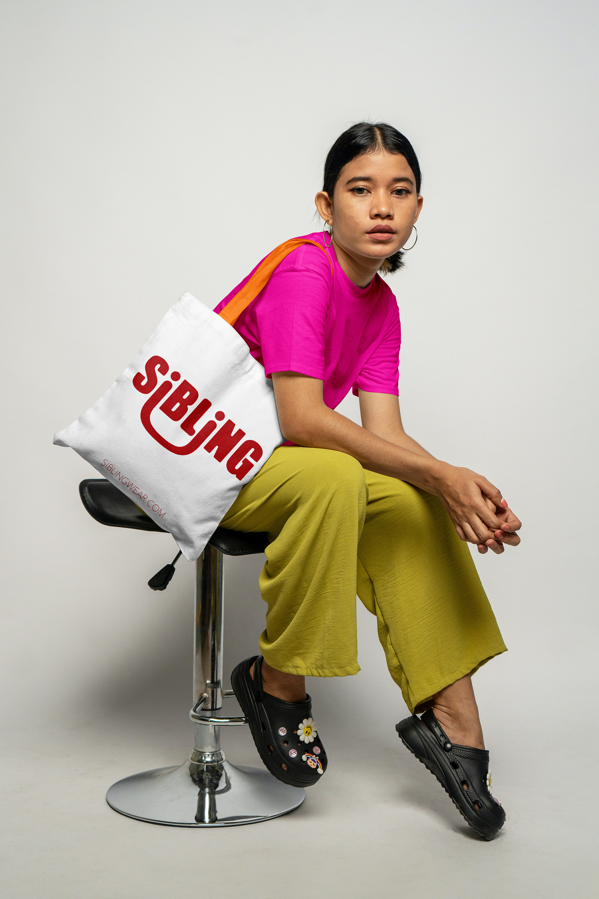
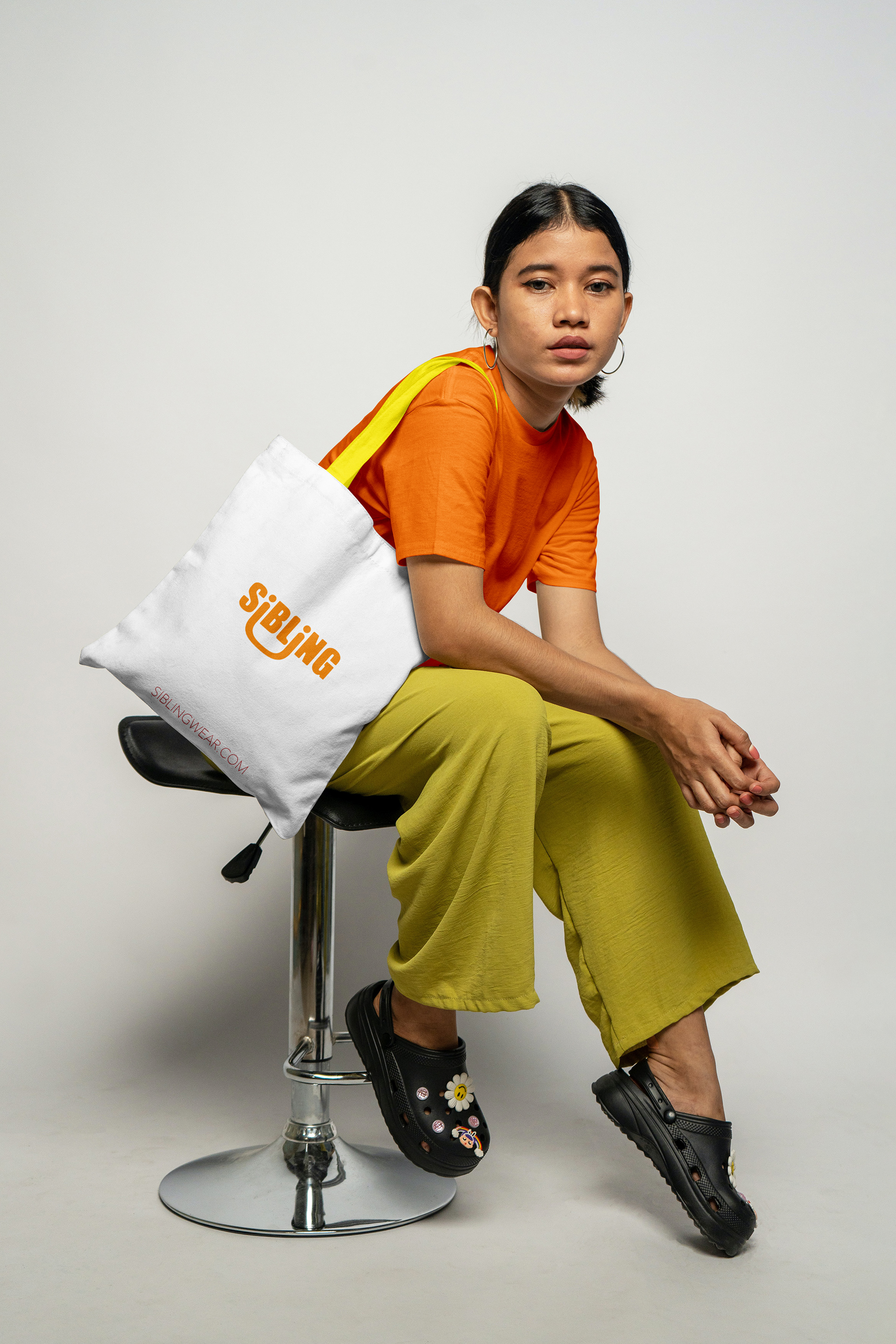
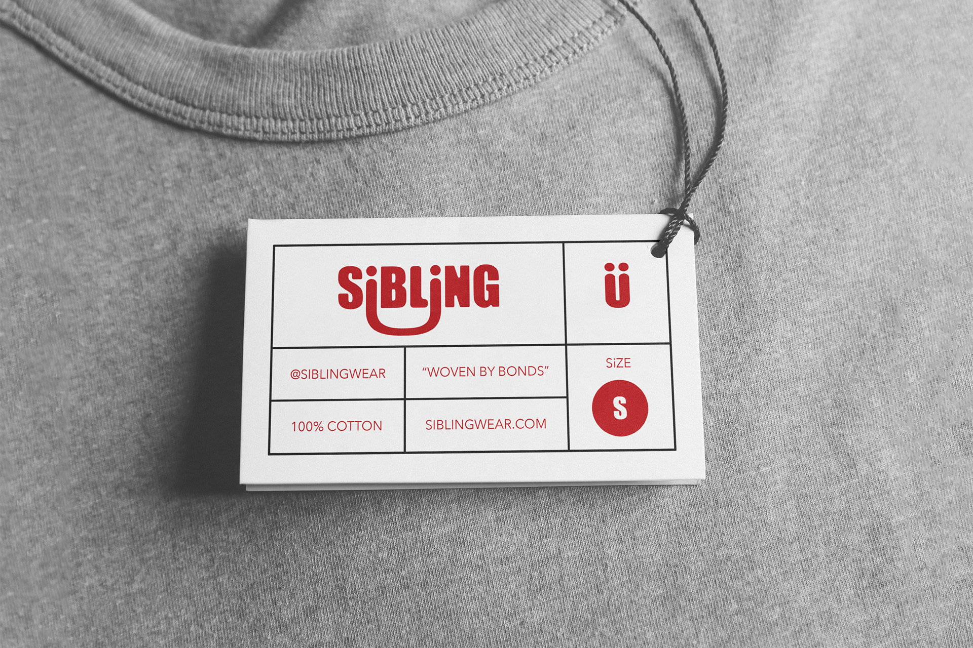
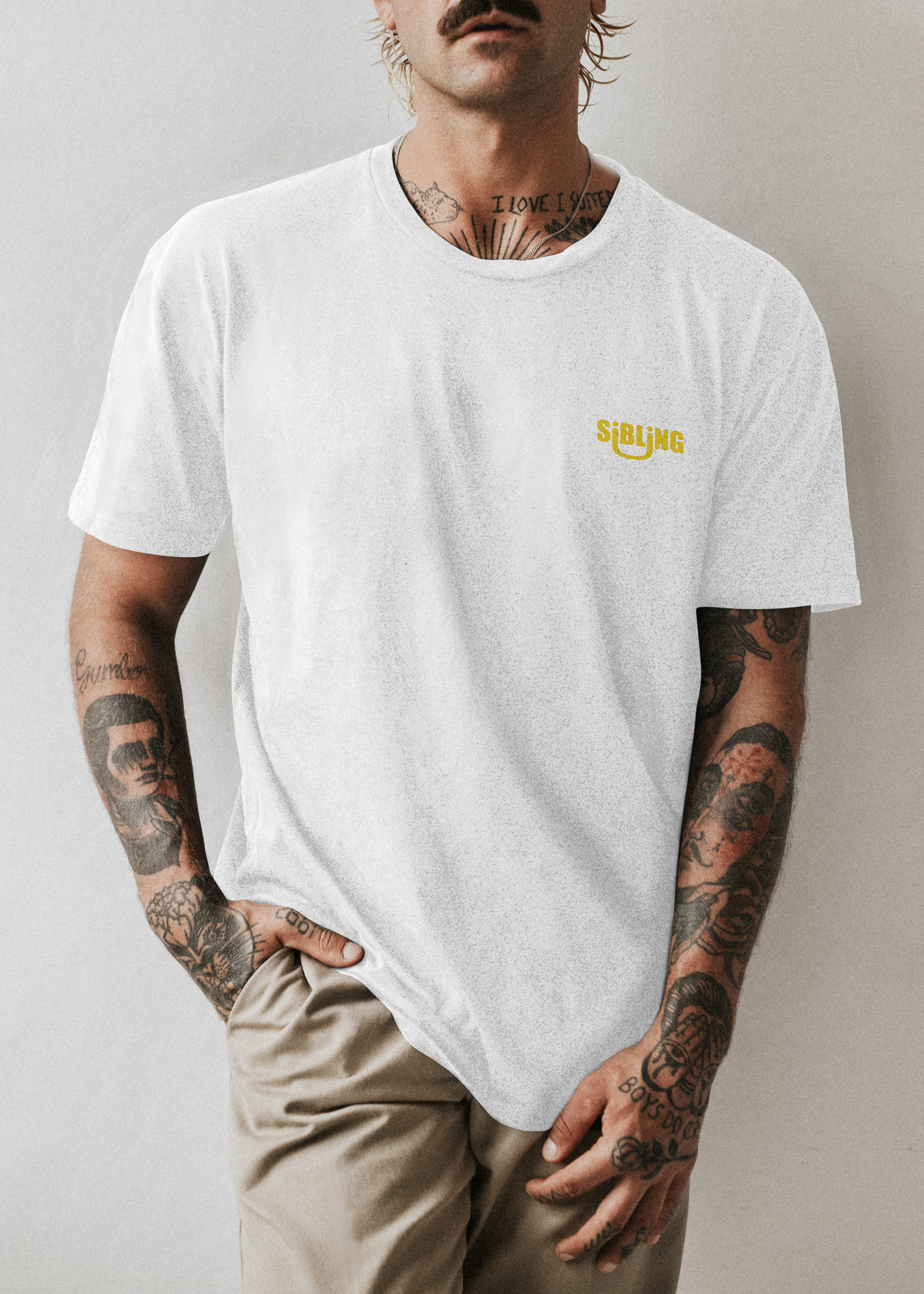
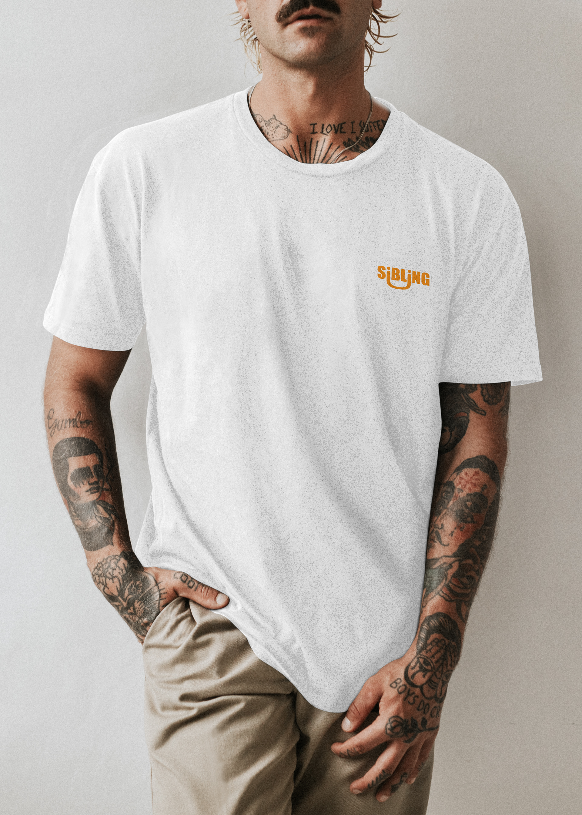
Sibling’s branding captures the essence of connection and shared bonds, presented with a warm, inviting aesthetic. The typography is bold yet approachable, with a cleverly stylised element in the "U" nestled beneath the "L" and "I," subtly reinforcing the idea of togetherness.
The tagline, "Woven by Bonds," beautifully complements the theme, evoking deep-rooted relationships—whether familial or chosen. The colour palette, rich in warm yellows, oranges, and deep reds, conveys a sense of warmth, comfort, and familiarity, much like the emotions tied to sibling relationships.